Dialog & Level Iteration
This build includes 2 new levels, in addition to minor changes to other systems, bug fixes, and aesthetic additions.
New
Levels
The first new level is a fairly compact and short level with only one respawn point. It begins to introduce certain obstacles that require slightly different solutions and flight techniques to pass. This was done as these levels are introductory, as these features will be expanded on in future to provide more challenging levels.

A new level that introduces a few new challenges.
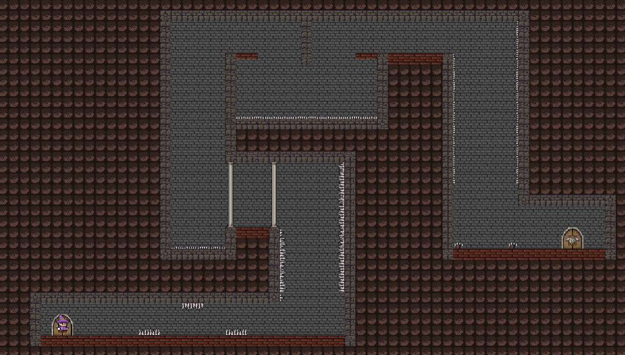
The second level is slightly longer, and is closer to the length that most levels will be.

Part of the second level, cropped to fit in this post (and to hide an easter egg!)
The second level contained a new feature that hides traps so they're barely visible. While they were visible, and immediately after a checkpoint, the response to these was not positive. See Feedback section for details.
Dialog Generation
This build also includes a new feature for showing dialog, or other general messages to the player that wouldn't fit on the message bar at the top of the screen that's currently used for the Checkpoint message.

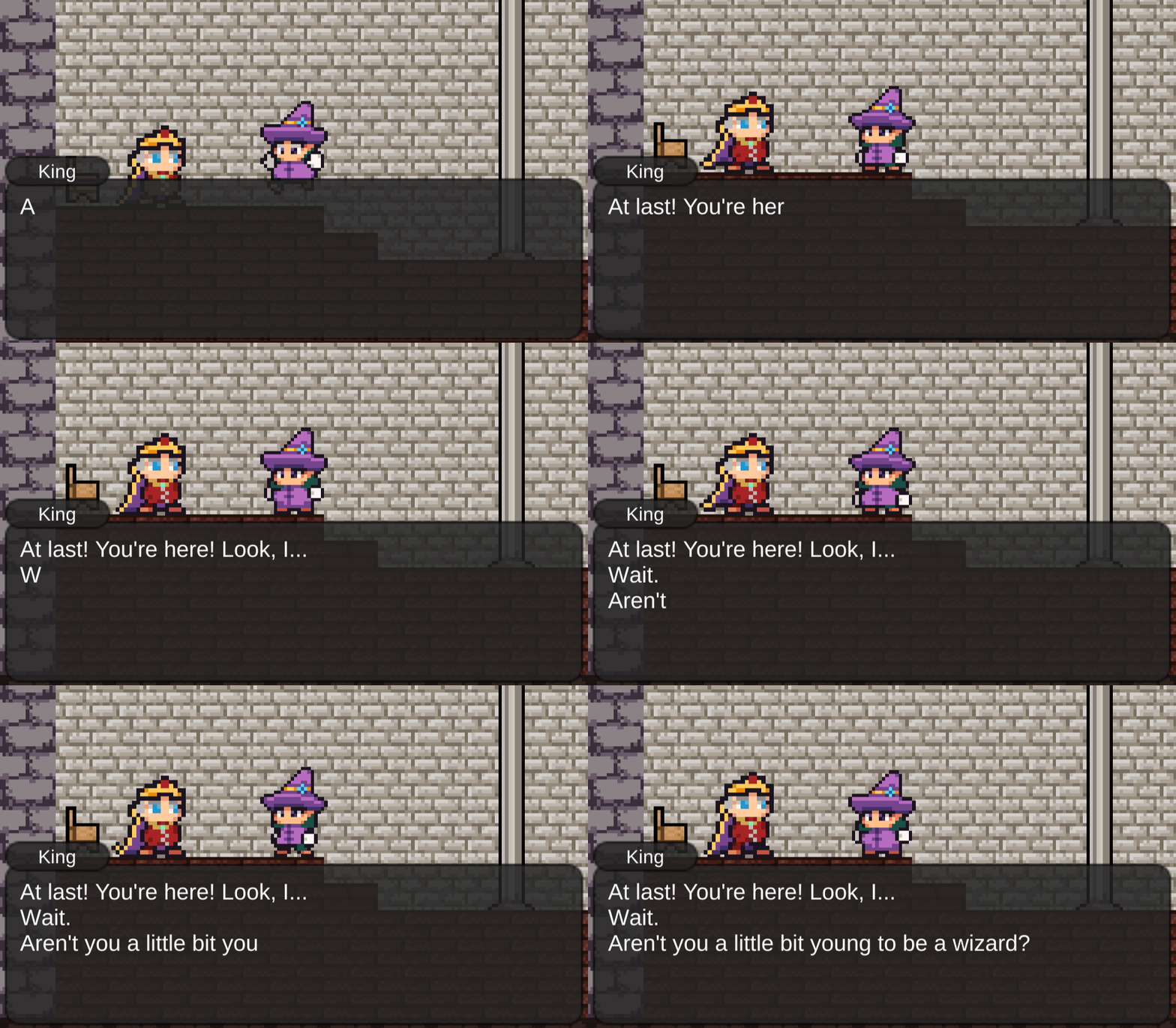
The opening dialog generating in the classic slow roll style.
Dialog that appears this way may be skipped with several buttons (Space, Enter, or clicking), and has several settings. Some dialog, such as that shown in the above gif, disable the player's movement entirely, and the player must skip or read through all dialog before progressing. In other areas of the game, movement is not disabled, and the messages may continue to appear without interrupting the player's ability to move or play. While this feature is called "dialog" and is used in the above gif for such a purpose, the game will not contain a great deal of story or interactions between characters. At some points, such as when the player gets stuck or finds an easter egg, the dialog text will appear with "You" written in the top left, as if the player character is speaking.
Stun Flash Effect
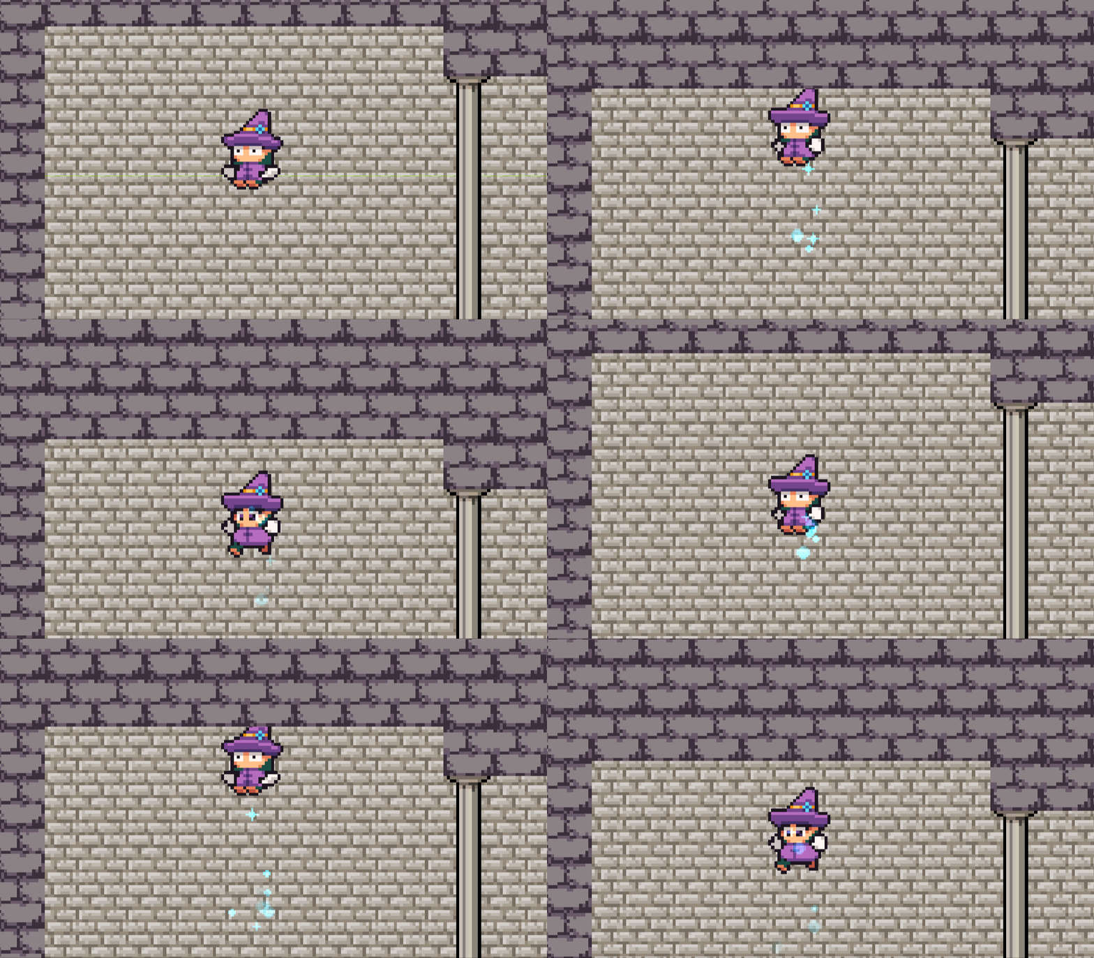
In the previous round of testing, it was noted a few times that when the player was stunned, it felt like a bug, or like the game wasn't responding properly. To mitigate this, a flash effect was added to demonstrate that something happened when the player hit their head too hard and had their flight disabled.

The player hitting their head at speed, with an orange/yellow flash indicating that something happened.
Bug Fixes
In the previous build, the player was able to be stunned or even die from sliding down walls, as the relative speed of the player was high compared to the point of contact. This approach did not consider the direction of that speed, and a new approach was taken for this build: instead of using contact points to determine whether the player's head was hit, the player's velocity and rotation is used instead. When colliding with a wall or the ceiling, the player's direction of velocity is compared to their rotation. If that player's local up vector is within a predefined angle of the player's velocity vector, the player is eligible to be stunned or killed depending on their velocity.
Also, the player sometimes lost flight when touching the side of a wall and moving downwards in older builds. That has been fixed in this build by only checking a subsection of the bottom of the player's hitbox. This means there's approximately 0.01 units that the player may be standing on the ground but the game will believe they're falling, but this error is considered to be acceptable.
Testing & Feedback
Level Feedback
First level feels like it needs more checkpoints
Sometimes checkpoints feel too abundant and other times they feel too far apart
This was one point I wasn't sure about. I want to have a balance between the mechanics being tricky and the levels being hard without making the game rage-inducing or just plain annoying. As per a suggestion from a tester, in addition to redistributing checkpoints, I'll be looking into having settings once the menus are in place. This will include preset difficulties (probably just easy - medium - hard), but will also allow the player to customise further, including toggling features such as the stun mechanic and dying on high-speed impacts, and choosing between preset amounts of checkpoints per level.
The part where the spikes are behind the pillars kind of felt cheap. I don't think it's a good idea to obscure obstacles like that.
This was another area I wasn't sure on, but this summed up most of the feedback on it; the game feels unfair when you get hit by a trap that hard to see and weren't expecting, even if you have a recent checkpoint.
I feel as though this is the kind of game you want to speed run
I was planning on having a "time trial" mode where you have to finish existing levels but with a time constraint and no checkpoints, but the concept of speed running would make a good extension to this, and I may include a timer so the player can see how long they've been playing the level.
Adding timing based/moving obstacles with sound cues could make for more challenging levels down the line
I wasn't planning on having moving obstacles, though I may look into it if I have time in the coming weeks. Sound isn't my strong suit, but while I may add sound effects and music over the game later on, I probably won't make the player rely on sounds to progress through the levels.
Get Magic Is Hard
Magic Is Hard
You're a wizard! But it turns out casting spells isn't so easy. Magic Is Hard.
| Status | In development |
| Author | J Weber |
| Genre | Platformer |
| Tags | Difficult, Fantasy, Flight, Funny, Magic, Singleplayer, Wizards |
More posts
- Axes & SpikeballsJan 21, 2021
- Crossbows, Boulders, & UI UpdatesJan 19, 2021
- Lights, Lava, & LevelsDec 11, 2020
- DocumentationOct 15, 2020
- User GuideOct 15, 2020
- Game TestingOct 06, 2020
- Menus, Settings, and Time TrialsOct 03, 2020
- Moving Traps & Graphical FixesSep 24, 2020
- Levels, Mechanics, and IterationSep 09, 2020
Leave a comment
Log in with itch.io to leave a comment.